As an undergraduate, I took a Typography class as a part Design Media Arts curriculum. The class had one major project during the 10 week quarter—design a book about an aspect of the famous typographer’s life, Eric Gill. In addition to research and design, each person must produce their books for 25 students in class, professor, teaching assistant and the William Andrew Clark Memorial Library in Los Angeles.
This DESMA Typography was a fundamental class in my career as a graphic designer. I learned how to use Adobe InDesign, typography guidelines, and basic layout.
Research and Development
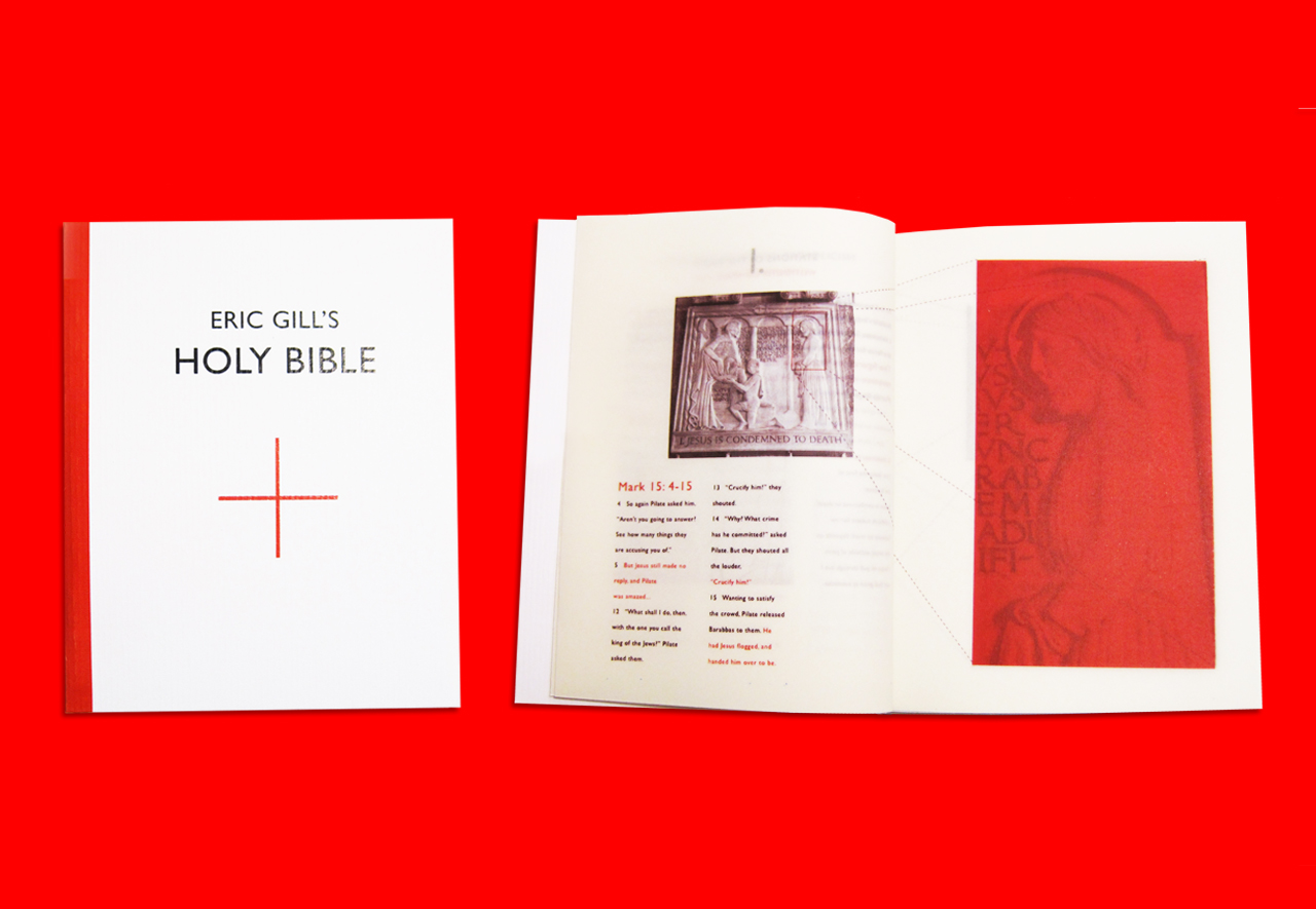
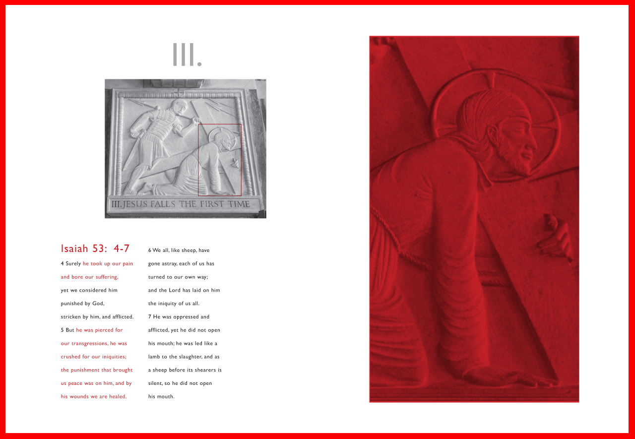
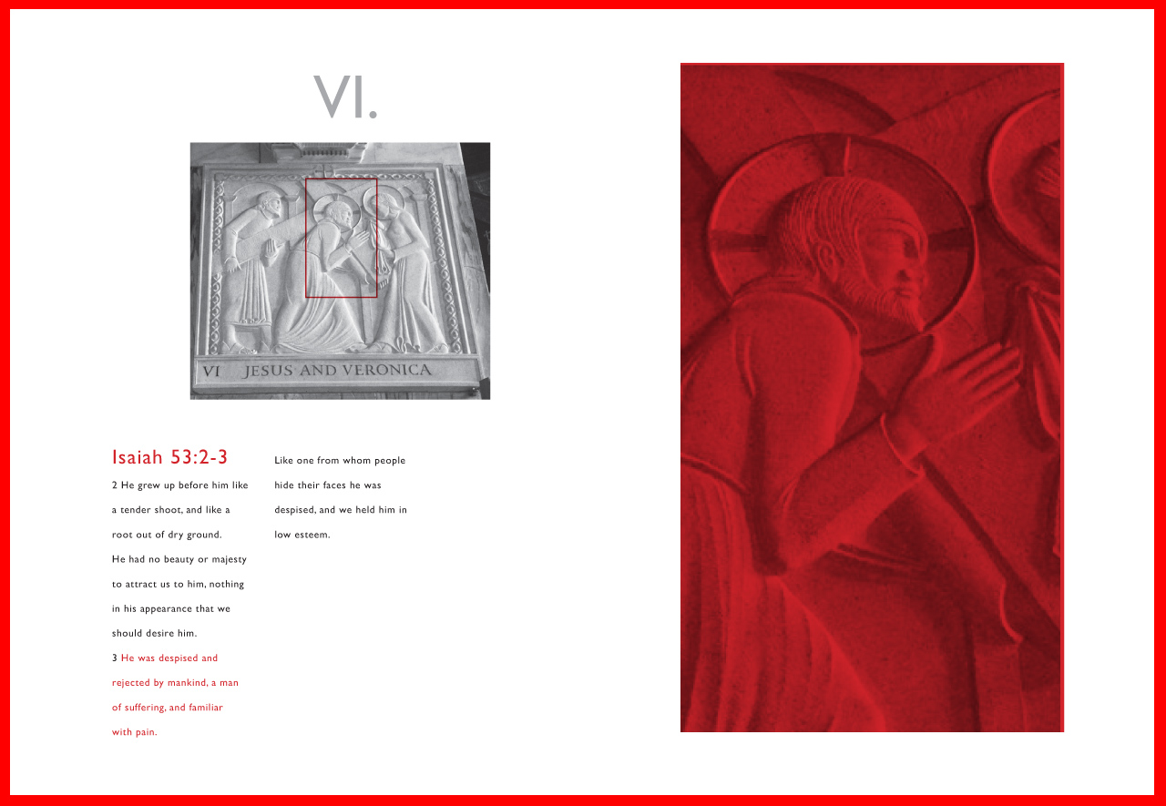
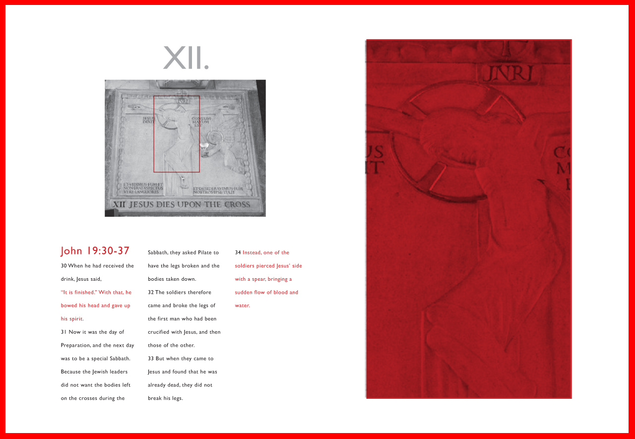
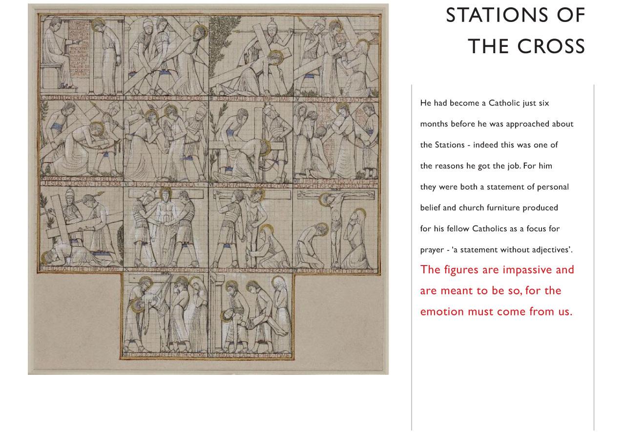
Eric Gill is a famous English artist who is known for designing the Gill Sans typeface. I designed my book that focused on Gill's controversial religious life. Although he was raised as an Anglican Protestant, he opposed the corruption of the church and then separated the church for a few years. In his teens, he claimed to "discover" a religion and adopted Catholicism. After converting to Catholicism, he was commissioned to produce the Stations of the Cross at Westminster Cathedral. His sculptures appeared "emotionless" for an extremely dramatic and emotional subject. In my book, I had close-up images of Jesus' stoic face in adjacent to the dramatic passages in the bible that refer to the Stations.
I chose this as my subject because his thoughts on Catholicism was interesting to me as a practicing Catholic.
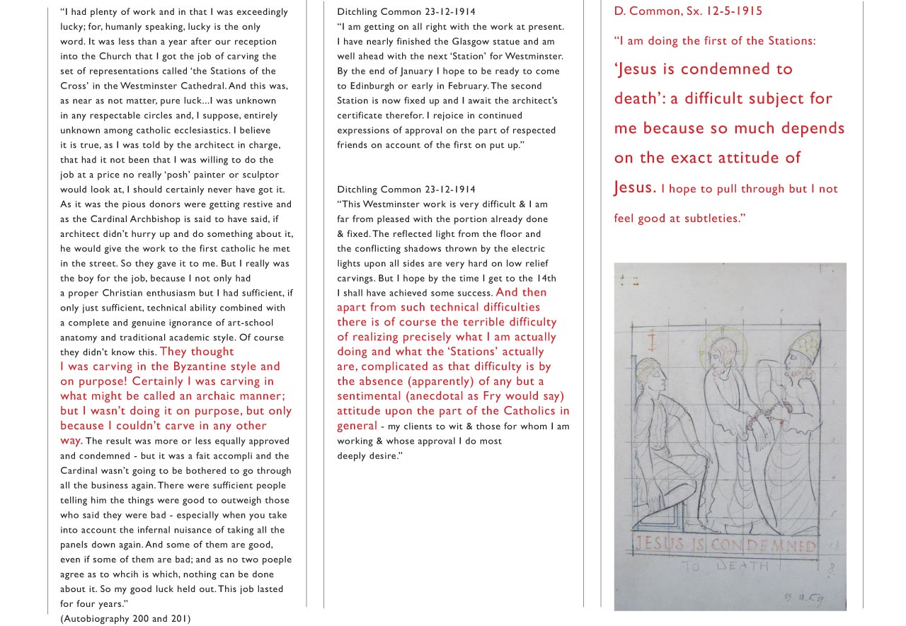
Below are examples of my research. I researched Eric Gill's beliefs in Catholicism through Dickling Common, Eric Gill's autobiography and catholicauthors.com.
Final Book
The final product is a 4.25”x5.5” book with 36 pages including cover. The cover is cardstock and the pages are made of vellum paper and printed from a laserjet printer. I chose vellum paper to simulate the thin paper used in most bibles.